 Scream opens with a black screen followed by a phone ringing sound effect, this hints at what is going to happen, when the film opens fully. Then the word ‘Scream’ appears in white and gradually the outsides flash red showing potential danger and as a sound effect we can hear screams, and the sound as if knives are being pulled out, starting to fade in. This knife and screams help to give the audience a sense of fear before the film has even begun. The lettering of ‘Scream’ eventually turns red, red portrays danger and blood. Due to the fact that it is a thriller it gives the audience a sense of fear.
After this we see a close up of the phone ringing, we then see a woman pick up t
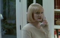
 he phone, and a mid shot shows her on the phone, during the phone call we can hear both the woman and the man on the other end of the phone. At this point we are unaware of the danger this man portrays as she does not seem to be scared of him and just tells him that he has the wrong number, to the audience this shows she is naive as she is unaware of the danger she is putting herself in talking to this man. The fact that it is a girl could uphold the stereotype that females are more vulnerable that males.
Then after putting the phone down the woman walks away and then turns as the phone starts to ring again. She picks it up and again we hear the man, this shows a repeat of danger as though a cycle is being created. This shows the audience danger as the man appears to not give up. This t
 ime we have a mid shot of her stood in front of big patio doors, these hint as an entrance and as though someone is watching her. After she puts the phone down and walks away the camera lingers on these windows showing a passage to entry, or the fact that she can’t get out. As the audience this again gives a sense of danger which is needed in a thriller.
From this we go to outside the house, with a tree and in the background a house which we presume to be the house she is in. This again portrays the idea that she is being watched, it also shows the fact that her house is a typical picturesque house that is stood alone this shows danger and the idea that it is both the typical house in a thriller as it is the complete opposite of spooky, looks like a normal perfect little house where nothing bad would happen.
After seeing the outside of the house we go back into the inside and here the phone rings again, this time she is in the kitchen and starts to talk to him about what she is doing. The fact that she tells him that she is about to watch a scary movie makes the audience annoyed as they know that this is a stupid idea, this is a typical feeling when watching most horrors. She then starts to pull the knives out of the knife box, these hints at future events and another sense of danger.
Throughout the opening there is no soundtrack, which is unusual as horrors and thrillers, a type of horror, usual have music to build up tension and to hint at bad events that are about to come. The music would usually make the audience be on the edge of their seats, yet by having no music they are no giving away any clue of what is going to happen which helps to keep the audience un-expecting any events that may come.


